



A much discussed topic in the world of picture framing is how to select the ‘right’ frame for a piece of art, or indeed an artefact. Aesthetic judgement is a controversial subject too, so much so that getting any two opinions to align can be the hard part of a consultation. The decision can’t be made using subjective rules, but requires quite a bit of trial and error with different materials and colours to try to ‘mock up’ the anticipated end result. And thankfully, between us, we don’t often get it wrong!
We have occasional visitors that know exactly what they want, some need a little guidance, yet others have absolutely no preconceived ideas. Most of our ‘serial’ customers trust us entirely to choose ‘what’s right’. Some send their work in with instructions to frame it how we think best. In truth there is rarely just one ‘right combination’ of ingredients, so narrowing it down by a process of elimination to leave the optimum is the usual procedure. What looks best usually is best!
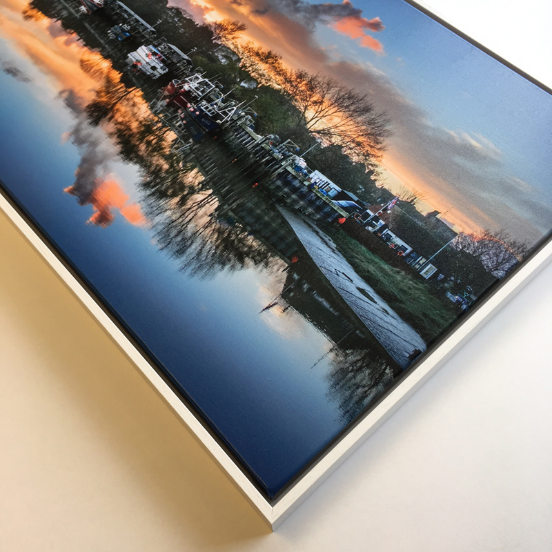
Everyone has their own way of going about choosing frames and mounts, and I will share one of my usual rationalizations that works here, at the very least in starting the dialogue towards finding the best choice. I try to identify the focal point of the piece, and then let the materials and colours of our frame enhance that focus. So we might match the eye colour of a dog portrait for example in our mount and frame. Similarly we might pick out the white of a boat in a predominantly blue painting.
Ultimately our aim is for the frame to be unobtrusive, but to enhance the artwork. There are other factors of course, such as material practicalities, where the piece will be displayed, cost and so on. This list is endless, and has different priorities for each job and customer, so there’s never any ‘one size fits all’ answer. We just like to exceed our customers’ expectations, and achieve a little ‘wow factor’ on collection!
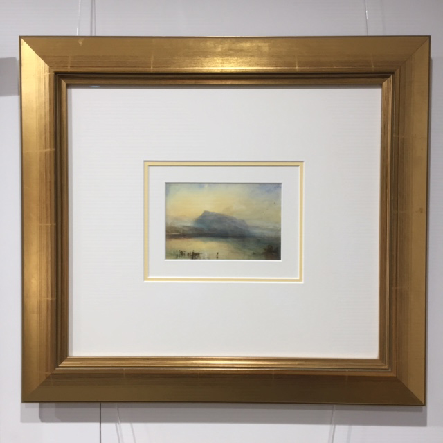
One item we use as a talking point in our gallery is our framing of a humble Tate Gallery postcard. Arguably the focus of the painting is the golden sun, which we hint at in the mount accent and the gilt frame. It is a useful example of what a difference the frame makes, as everyone can identify with a simple postcard, and then see that the finished result could easily grace their lounge chimney breast! It helps that we used a broad triple mount, ‘magic glass‘, oh and that the painter of ‘The Blue Rigi Sunrise’ was not bad with a brush.. being a certain Joseph Mallord William Turner!
Tim
Tim used this method to help me select my mount and frame for a recent framing, the results are amazing. The chosen colours set my print off to perfection.
Thanks for that Ellen, glad you liked it!