



Some of us are not famed for our fondness for pastels. Not because there is anything at all wrong with them artistically (indeed, there is a strong case for choosing the medium when considering commissioning a portrait – I have done it myself in the past). No, it’s the dratted instability of the things that plagues me. A distant memory of ‘huffing’ a breath across a picture to clear away specks of fluff or dirt gives me the shivers – watching the pigments fly in all directions – not one of my better moments.
In time, and with careful – very careful – handling, I have come to appreciate the subtlety of pastels. A recent and special commission involved updating an ornately framed pastel of a father, and a companion picture of his (then) young son.
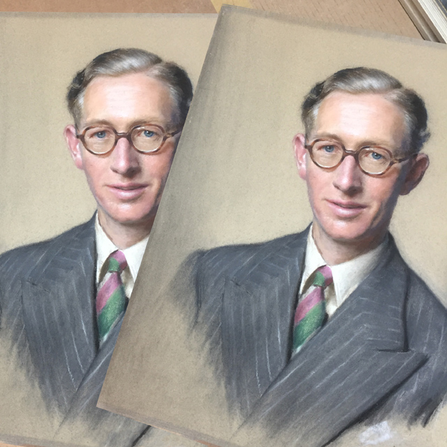
The original pastel and the fantastic copy by Jim, but which is which?
Painted in 1946, the father picture shows a headmaster, framed in a heavy gilded frame completely suited to the time and place it hung at his school. The task was to re-sit the pastel into a more contemporary frame, which we did with a plainer Arqadia Canaletto gold moulding, with a handpainted internal fillet inserted to create a ‘trough’ (to catch those pesky drifting particles so they don’t sit, trapped, at the bottom of the frame). We sat the image behind TruVue ‘magic‘ glass to protect the pigments from fading, and did the same for the picture of the young son.
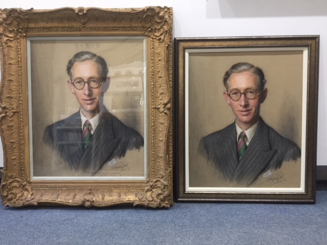
The copy is in the old ornate frame, the original in the new simpler one
We don’t believe in wasting a perfectly good antique frame, so we arranged for our marvellous photographic genie, Jim Holden, to copy the original of the headmaster onto high quality art paper, and inserted it into the original ornamented frame, so that it can take its rightful place back at the school.
The more modern duo now sit on the wall of the customer’s home, Father and son now happily in tune with the updated décor schemes we have today.
Tilly
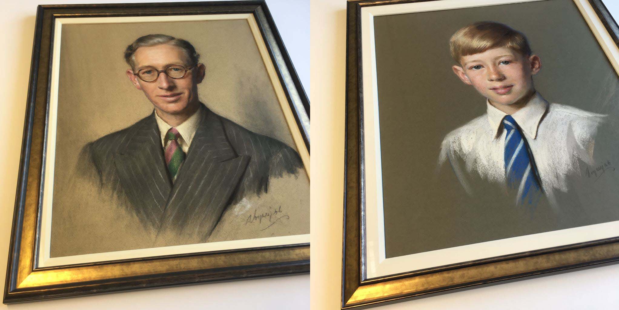
And here are father and son, happy in their new frames